The Guardian news app
New business model trial
Context & Goal
It's detrimental for the Guardian that anyone can access quality news reporting, regardless of whether or not users can afford to pay.However, it’s also detrimental that the Guardian can remain sustainable to continue producing content.In order to keep this balance the company wanted to run an experiment where it would give users a monthly allowance of free articles, before asking them to subscribe.Website access would remain free.My role
Led user research and design of a seamless experience for Guardian app readers transitioning to a paid model;Collaborated with executive leadership; product owners; developers; copywriters, and various other team members to increase the number of supporting app readers, not only by designing a better experience, but also by providing insights to assess and guide this new business model.Challenges
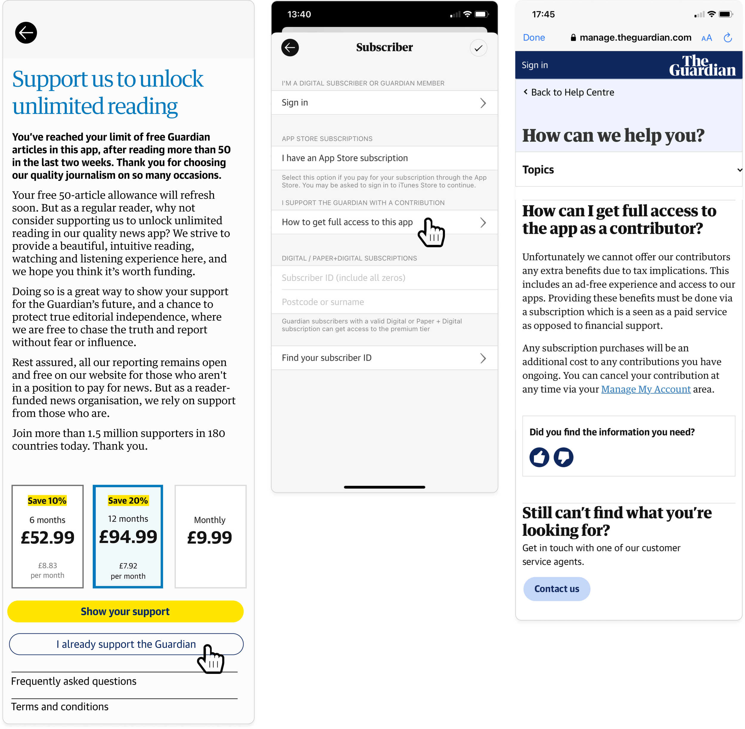
Some of the challenges with this new model included:In App Purchase VS buying a subscription on the Guardian website: users with a digital subscription with full access to the app needed to be logged in on the app to be recognised. Often they were not. Which meant that we were blocking these paying readers from accessing the app.Users with a “Recurring contribution” (similar to a donation) lost access to the app. These users needed to change to a different subscription plan to benefit from the unlimited app access.When users buy the app through the App Store or Google Play, the Guardian loses a cut of its profit: how could we mitigate this?
You can read more on this project on The Guardian.(…)we are going to begin trialling metered article access in our Live app. Our first test will mean a tiny percentage of our most frequent users (…) will be prompted to become Guardian supporters if they want to continue reading beyond a certain number of free articles. (…) This test is the latest development in our supporter strategy, as we look to engage and retain even more readers from all over the world. Our editorial, design and product and engineering teams have made a number of improvements to the Live app over the past six months, securing its position as one of the best news experiences in the world.”
Caspar Llewellyn Smith, Chief Product OfficerProblems with previous design
Putting the burden on the user
The previous flow put the burden on already paying users to find out what type of subscription they had; why they didn't have full access to the app and what they needed to do in order to continue reading.If users were lucky enough to figure out that they had what we called “Recurring contribution”, then the flow would take them to a help page, where they would have to read the content to learn that they needed to cancel their contribution and then take a subscription, via the app or the website.Contextless cancellation journey & no guarantee that users would buy a subscription after cancelling their contribution.
Since users had to proactively cancel their recurring contribution, the system had no context of where users were coming from and why they had chosen to cancel their contribution. Users were faced with a long cancellation journey with irrelevant questions.In the end of the cancellation process, we had lost a paying reader, and had no guarantee that the user would actually go and buy a subscription. On top of that, user's only option would be to buy the app through the App Store or Google Play, meaning that the Guardian would lose part of its profit.How we fixed it
Guiding users through a tailored journey.
By making “Sign in” the main action we were able to quickly identify users; explain what type of subscription they had and guide them through a tailored journey.Allowing to easy switch subscription, instead of cancelling.
After identifying users on the app, we could guide them on a journey to switch their type of subscription, instead of cancelling and hoping that users would buy the different subscription afterwards.

This meant that we would not lose any paying readers.

Because the system was carrying the context from the app, this also meant that the process to switch from one subscription to another was much shorter and relevant.
Refining with usability testing
Usability testing allowed us to refine the journeys; copy and price offer.In bullet points…
Process and responsibilities:
Developed a deep understanding of the business goals and rules around the app meter, including legal and technical constraints;Designed thorough flows covering all possible scenarios; user types and platforms (iOS and Android), addressing the complexities arising from various Guardian user account states and tailoring journeys to accommodate each unique state;Created wireframes and prototypes for illustration, discussion and testingConducted usability tests to gather feedback both on the journey as well as on the business strategy, to understand how users felt regarding the concept in general;Provided valuable feedback to the business to adjust the meter rules, based on research, ensuring that the concept and the experience were not only optimised for conversion but also aligned with the Guardian’s values and user-centred principles;Designed high fidelity and detailed wireframes and supported developers through very complex technical challenges, consistently striving for a delicate equilibrium between user experience and technical constraints;Stayed actively involved in refining rules and experiences based on ongoing user research and feedback.
Some nice words from my team
"Really proactive and great on detail, very much a get stuff done person, but with thoroughness and great thinking” - Alex Breuer, Executive Creative Director at the Guardian


